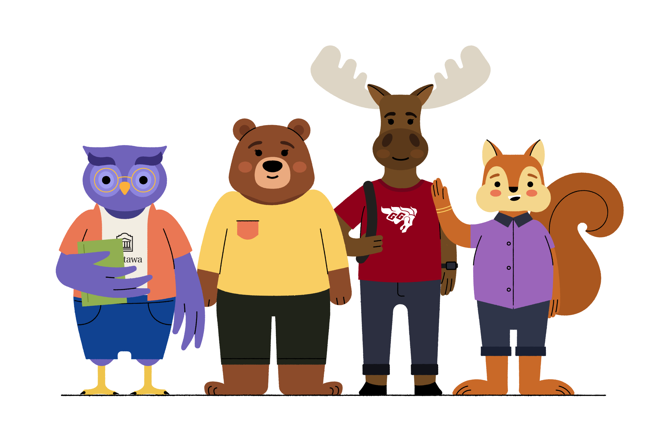
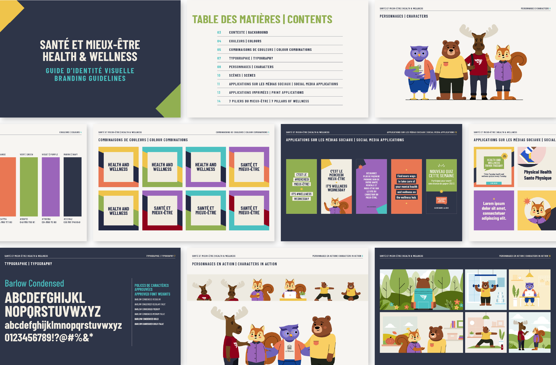
After learning about the old brand's limitation and clients' needs, I had the opportunity to re design the Health & Wellness brand at uOttawa. The new materials are adaptable for any future need!
Company
University of Ottawa
Date
March 2021 - Ongoing
Tags
Branding | Illustration
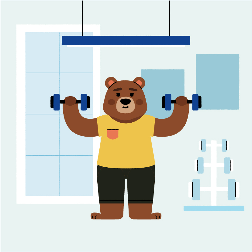
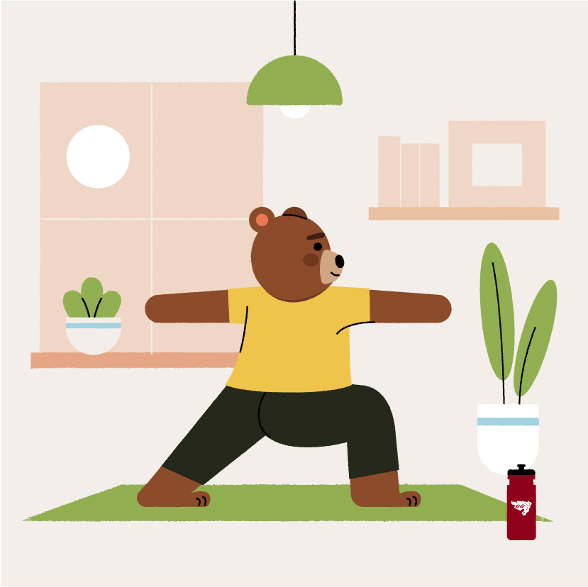
The old characters weren't built to be used in different scenarios or positions. The new design allows for all characters to be placed in any kind of situation and have a friendlier and more approachable tone!


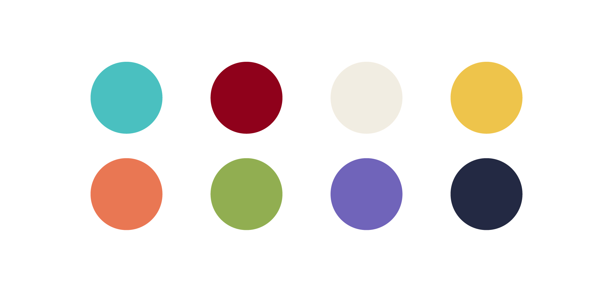
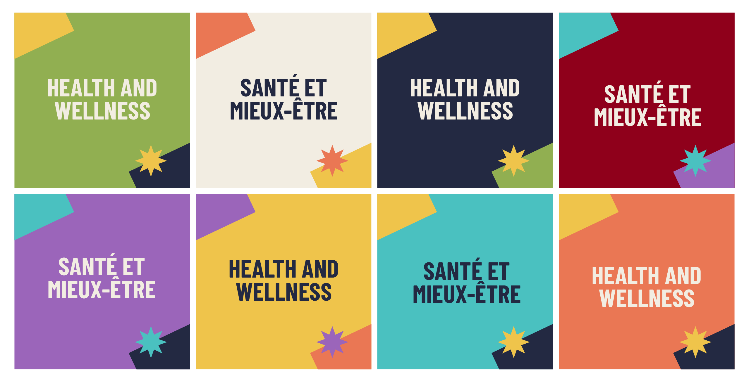
It was important to keep Garnet and Turquoise in the pallette to represent the University and what is historically associated with the Wellness brand. I expanded the colour pallette to assure there are sufficient options for all materials while keeping a calming tone. Below are a few examples of colour combinations that can be used!
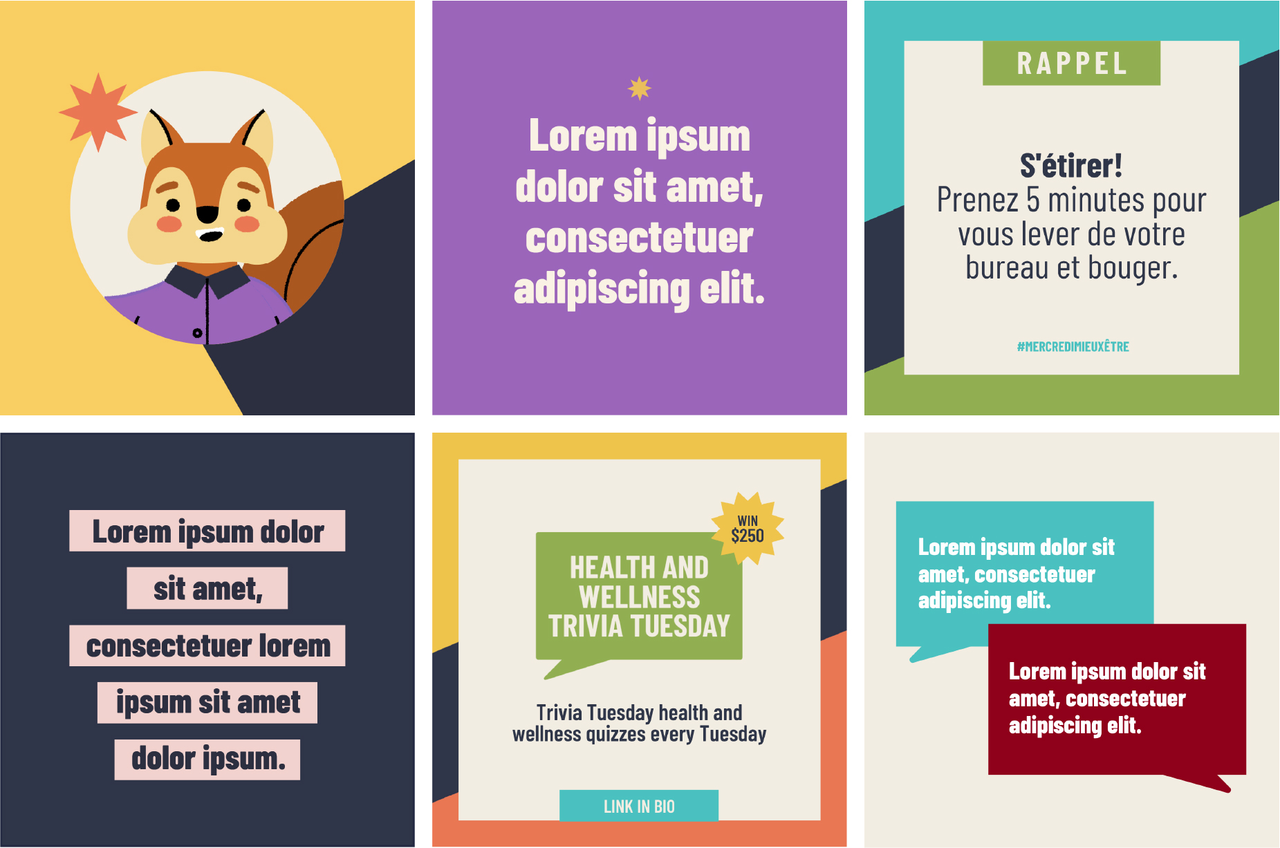
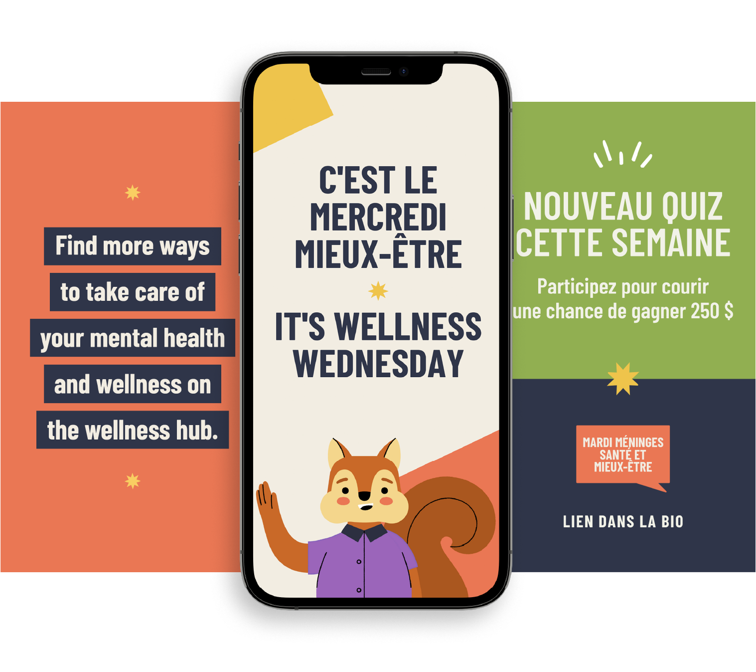
Working closely with the marketing agent, I create various social media assets for the wellness brand. Here are a few examples using our colour pallette and brand font.
Using the new graphics and brand colours, I created an animation intro for the Wellness Talks.
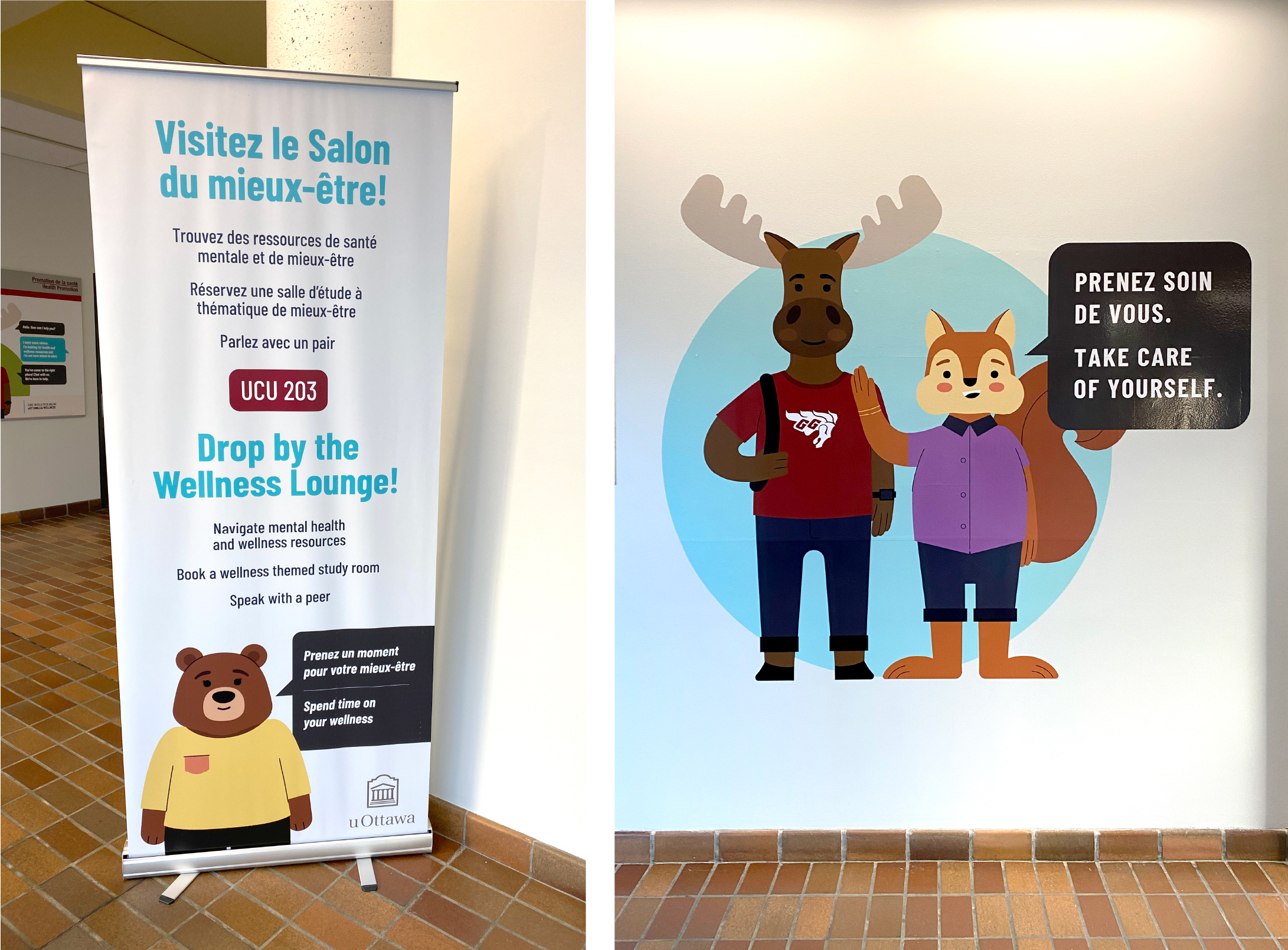
I created many printed materials that are placed accross the University to promote the Wellness Lounge. Roll-ups, posters and wall decals are just a small fraction!
An important piece of the Health & Wellness brand is the 7 Pillars of Wellness: icons used in many materials to promote well-being. I re designed these icons to be aligned with our colours and illustration style.

Once the visuals were established, different departments were asking to use the new brand! I developed simple branding guidelines and 'tool box' filled with fonts and graphics people might need to correctly use the brand!
I am constantly creating new assets for the Health & Wellness team to promote different acitivities and services using this flexible brand!