During my time at The Ottawa Hospital, I had the chance to work with many organizations like QUILT. QUILT was a newly formed group of professionals focused on better long-term care. Since they were all coming from different places, they needed a fresh brand to unify the new group!
mHealth Lab
CANImmunize
Date
May 2018
Tags
Branding
I began exploring different concepts: the letter ‘Q’ seemed like one idea, then the coming together of various shapes creating one image. None of them were really working for me. When I presented these, we identified that the important ideas to convey were: coming together and the journey of patient's life. All very big level concepts that needed to be illustrated.

After a few more iterations of logos I didn’t like, I decided to message a friend for advice. I explained to him my story and what I was trying to do. That’s when he said “Why don’t you try shapes that are weaved together?”

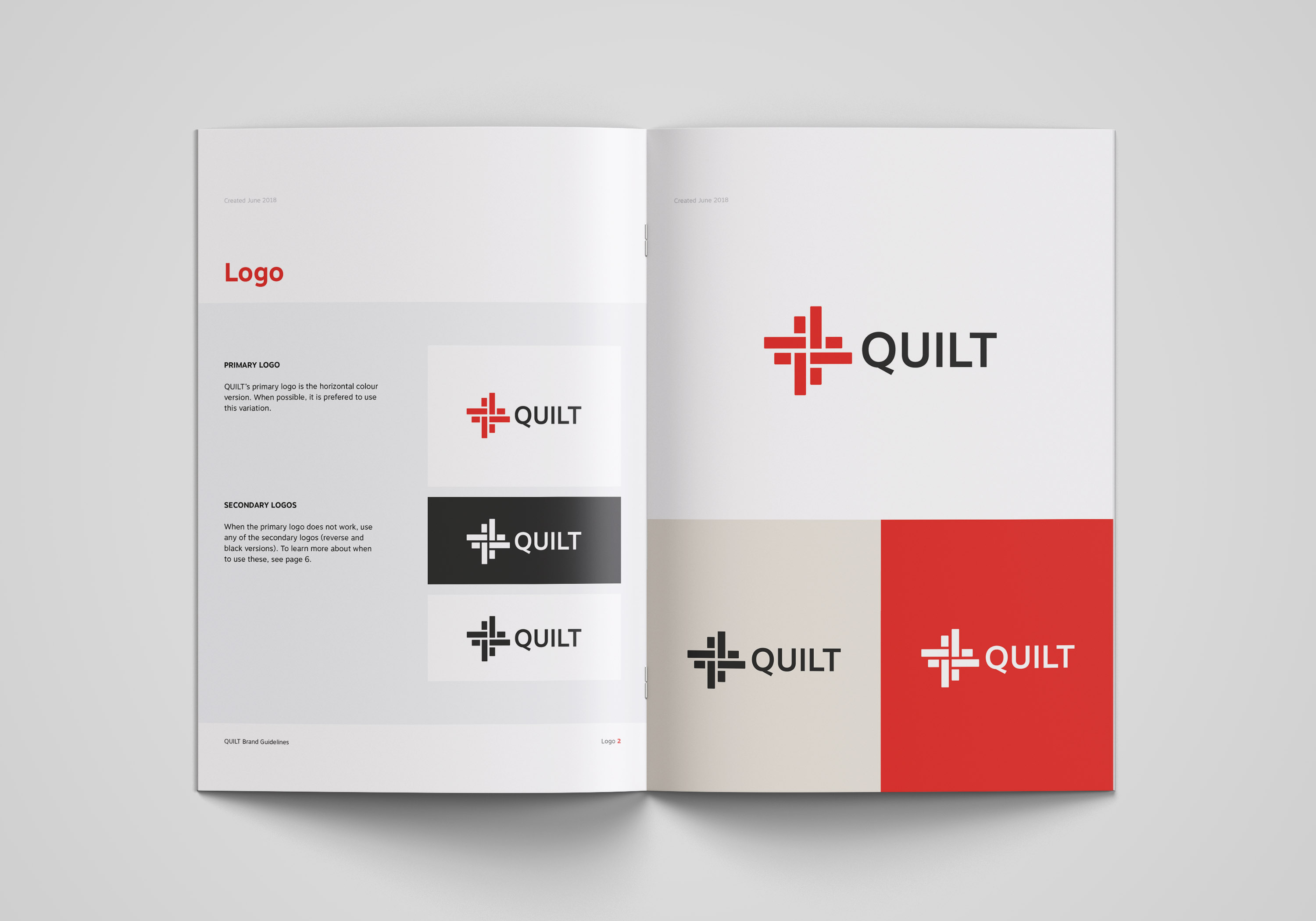
After many iterations, we finally arrived at the one! The entire team was on board, therefore I began developing the brand guidelines.

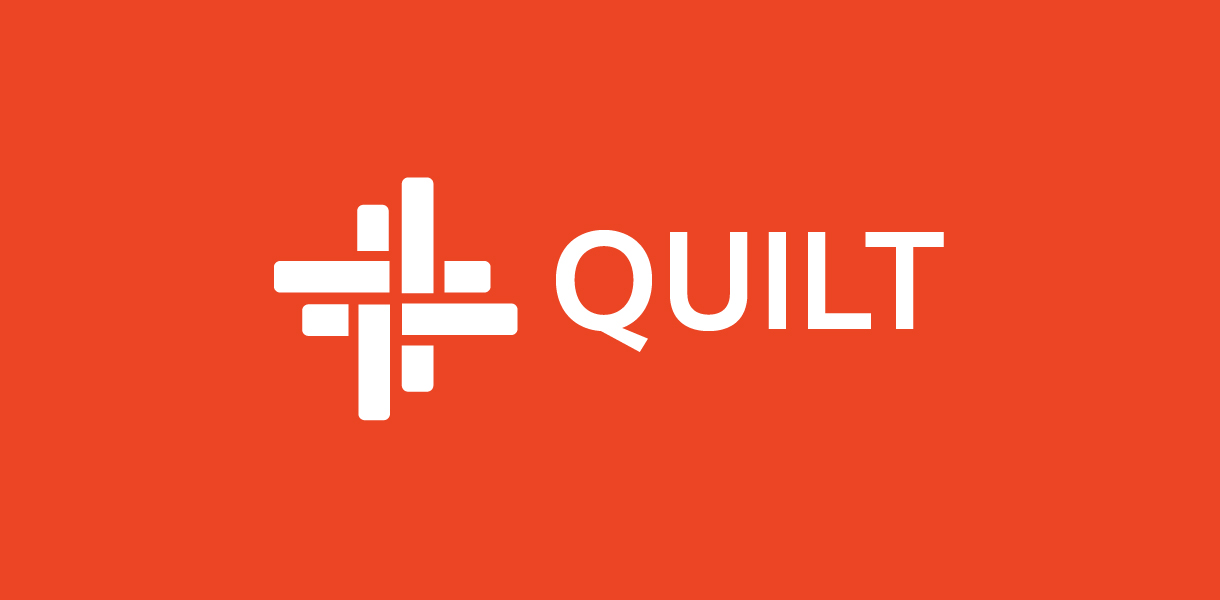
Since one of the major participants' brand colour is red, we stuck with it for this one. We also wanted to stay away from blue since health care is often associated with this colour.
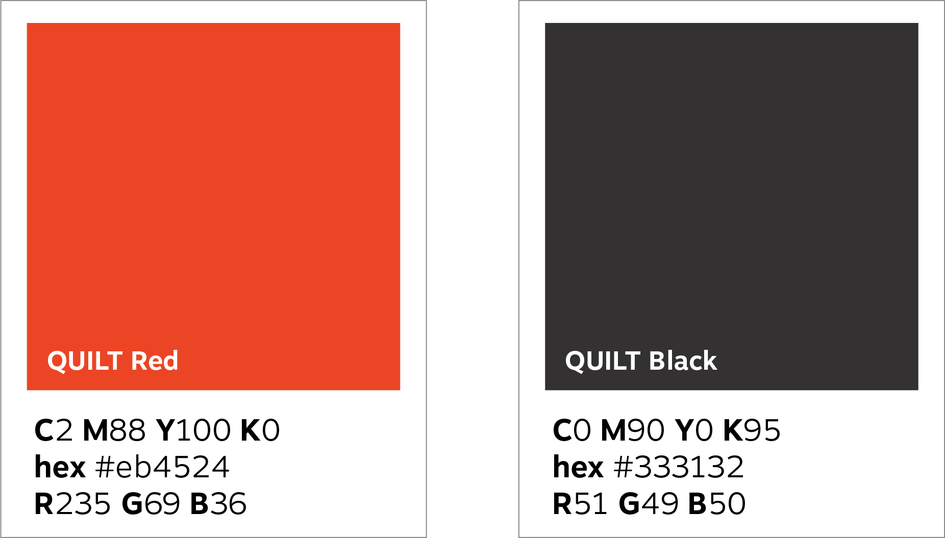
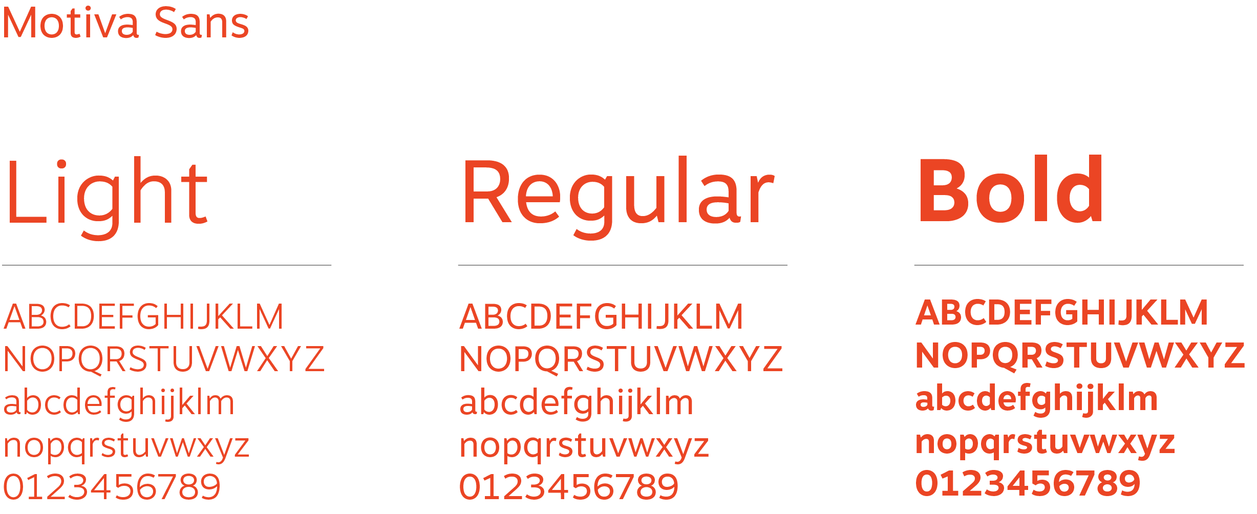
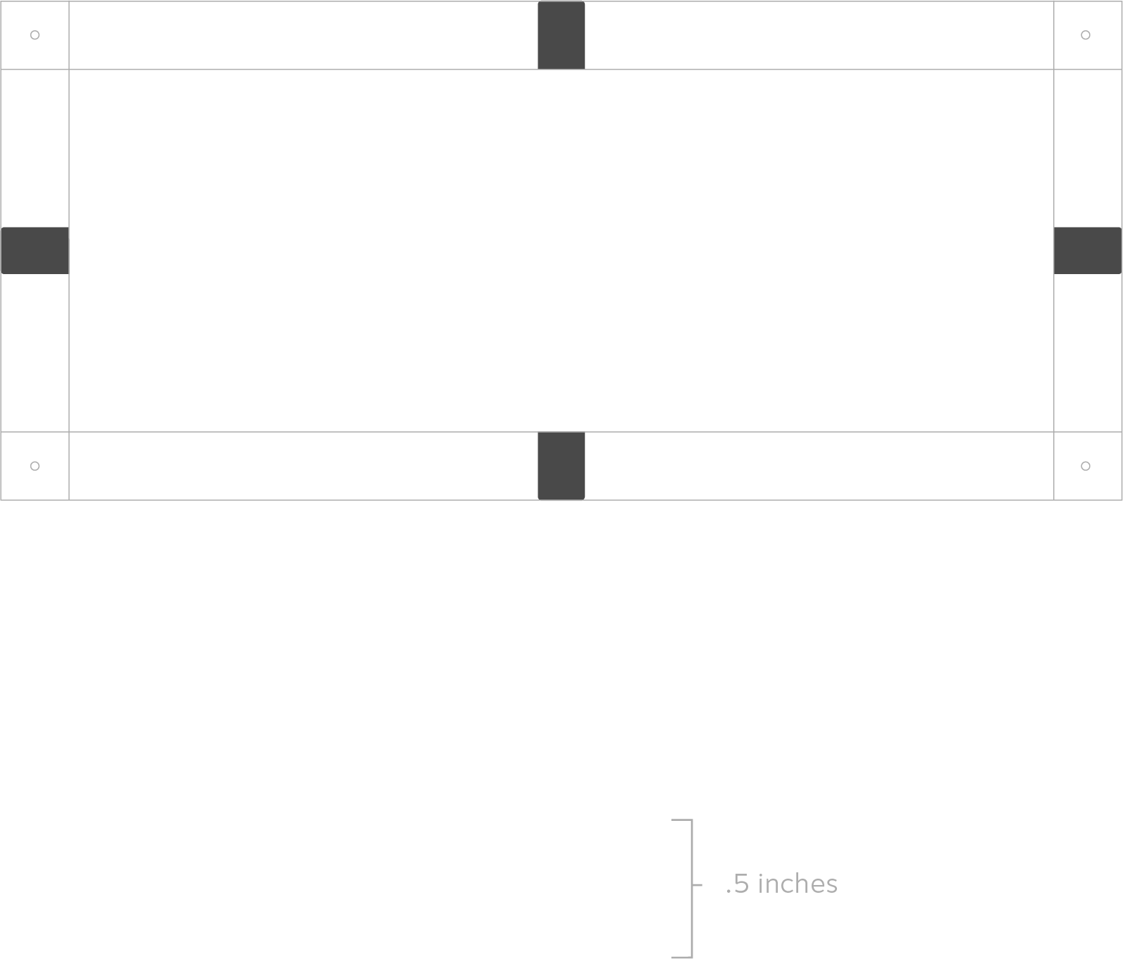
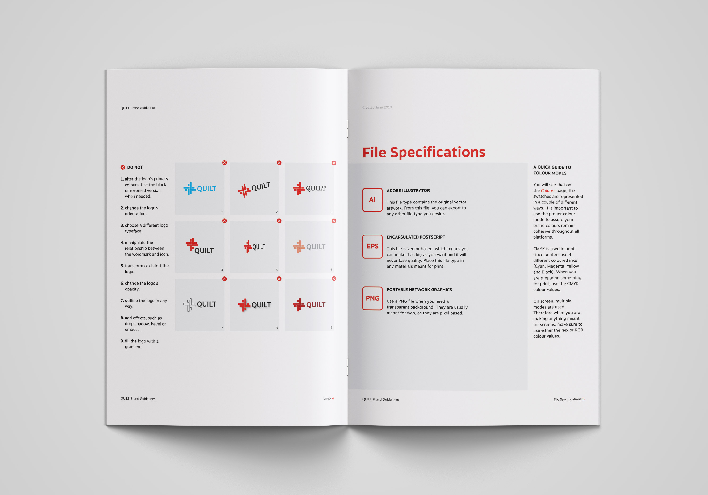
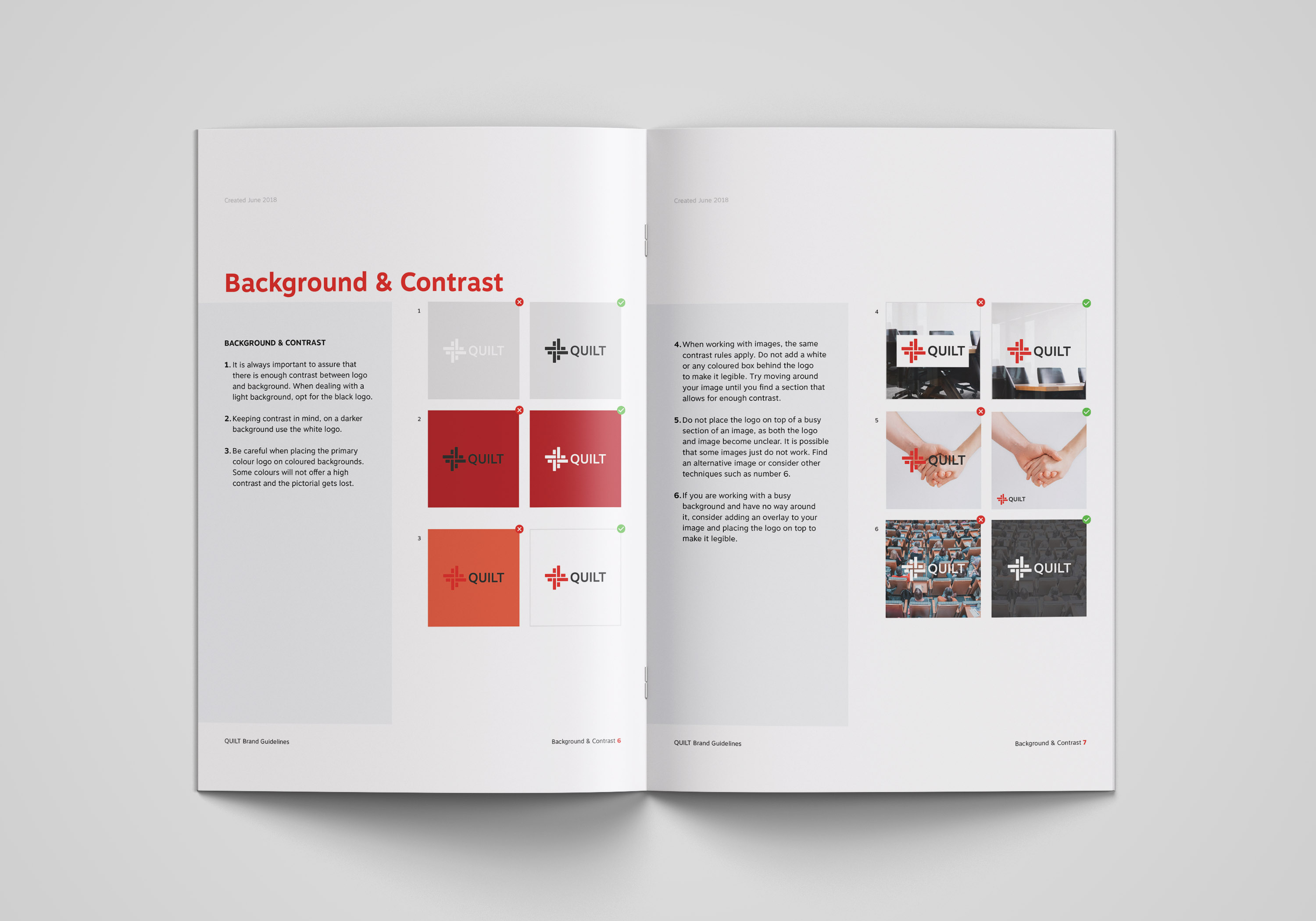
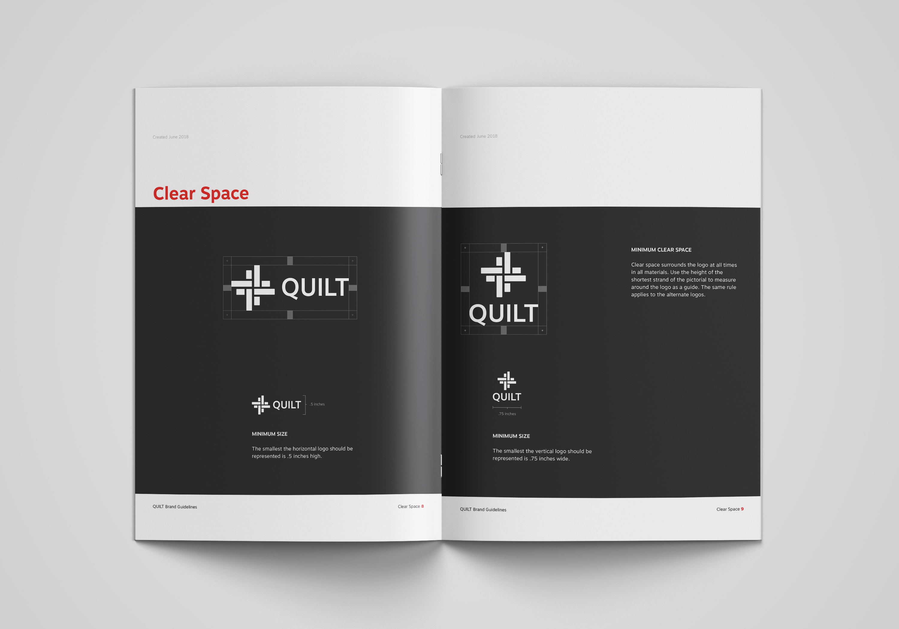
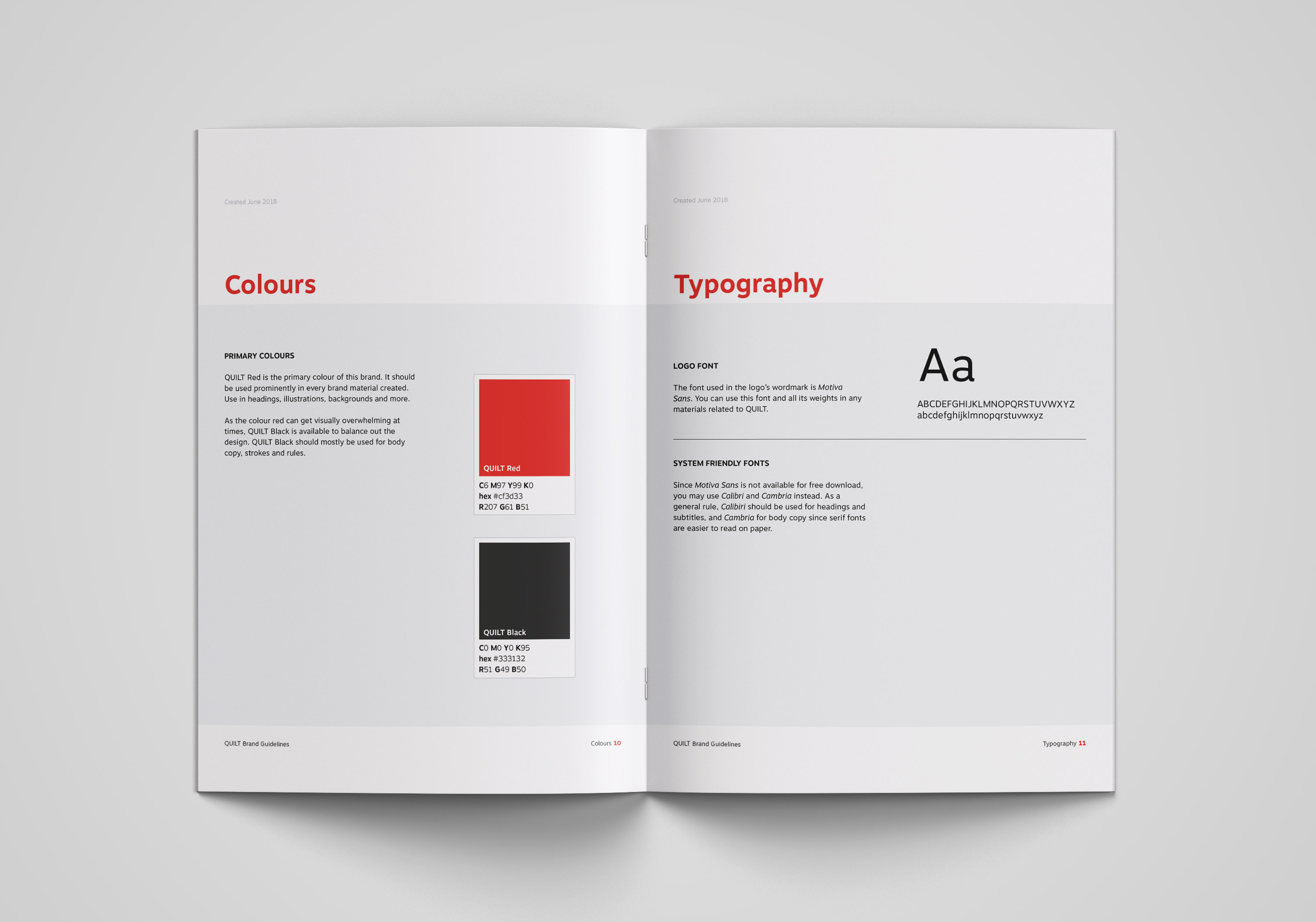
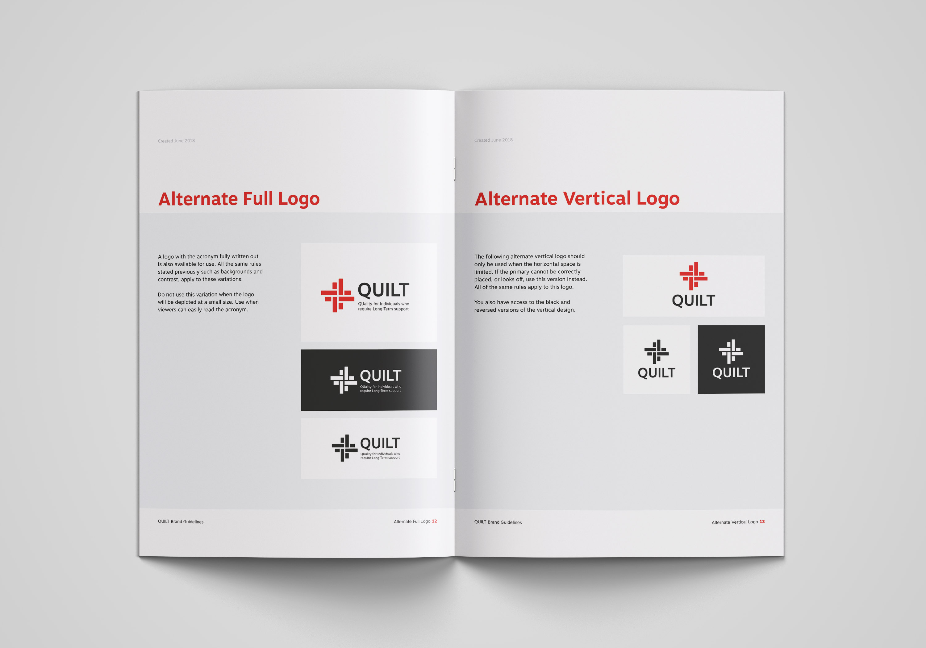
I prepared a simple branding guidelines document to share with the team to assure the brand is correctly used in the future.
